


As a technology company, we understand how quickly the world surrounding us changes. Nowadays, lack of development is not only standing in place but also taking a few steps back.
We constantly take care of the development of our platform. We add new functionalities, devise extra modules, and address our attention to user feedback, which is extremely significant to us. It’s worth mentioning that it was a very important year. We won an investor over, opened a new branch in Szczecin, changed the localization of the office in Warsaw, our team extended, and now we would like to introduce our new corporate identity.
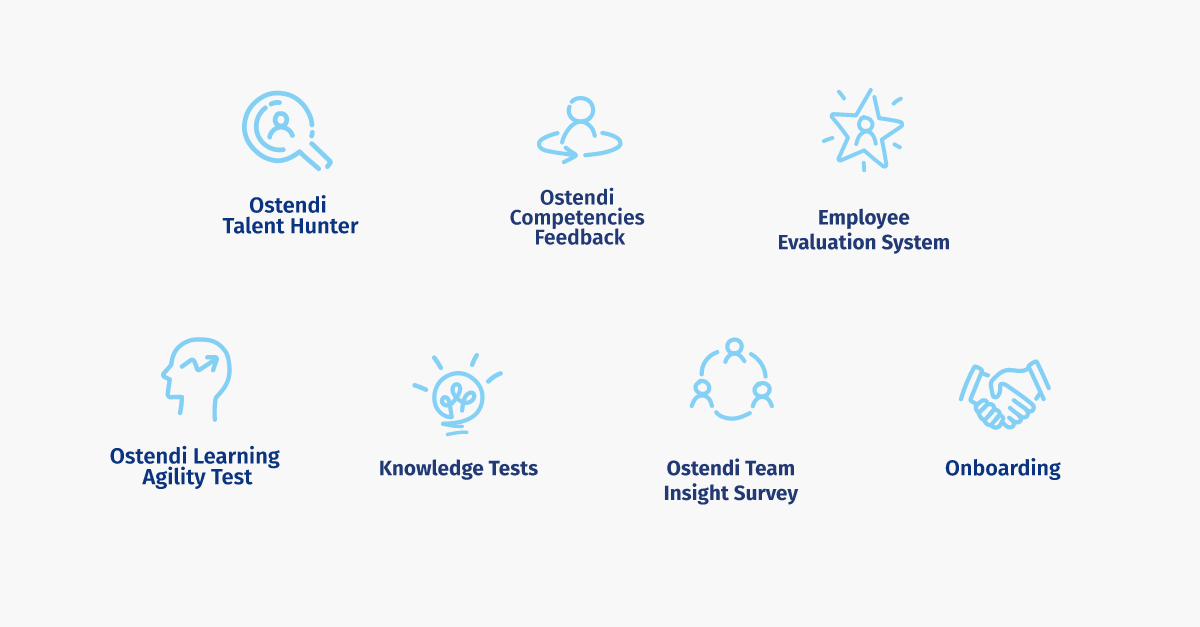
Our goal is to become a platform that manages all soft HR processes – from the recruitment process to, the onboarding of a new employee through his development and maintaining him in the organization, ending on the outplacement. Our flag products – Ostendi Talent Hunter and Ostendi Competencies Feedback enjoy the client’s esteem. But we don’t rest on our laurels and aim even higher.
Why we decided on the new corporate identity?
The change in the logotype underlines the fact that we work in HR and we address our offer to HR workers. But we are not an advisory company but a technology organization – we offer tools and solutions which enable you to obtain reliable data about employees and processes in the company. We digitalized knowledge and experience and created technology that addresses the needs of HR workers. We are happy to share it.
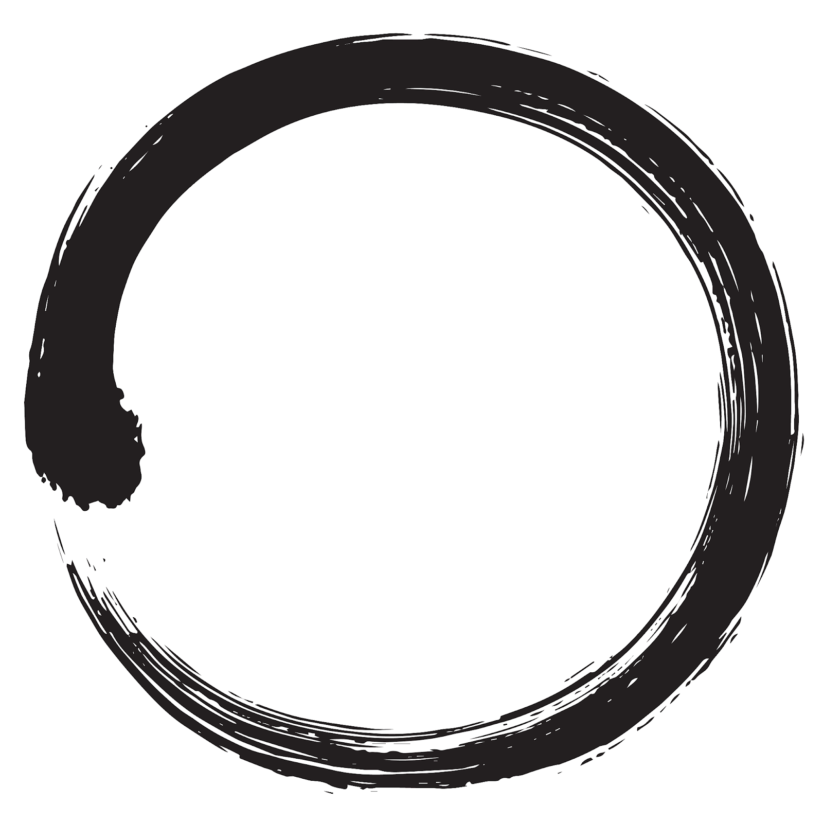
But we don’t forget about our origins. The basis of our logotype is still the circle inspired by ensō – the Buddhist symbol which alludes to zen philosophy and reminds us that progress is an endless process. This symbol reflects the values which we share.
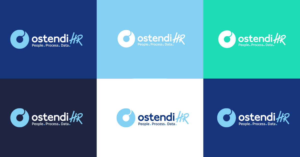
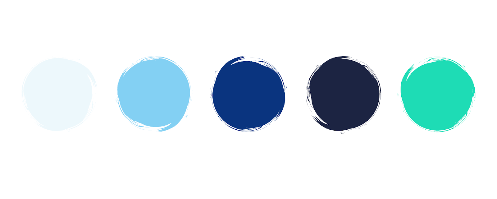
We changed not only our logo but also the choice of our colors. Fresh and energizing turquoise coordinates with the philosophy of openness and pursuing the ideal. Energetic green breaches refresh and complete all range of colors. Aquamarine symbolizes energy and luck, and toned navy blue underlines our commitment to quality and a sense of responsibility.
Along with a new logotype, we created new symbols for our tools. The look of signs is not accidental. We wanted to make sure that those symbols come across as freehand. As a result, we underline that the technology we create is made for people.
The changes are also caused for practical reasons. We wanted to ensure that before entering foreign markets Ostendi brand has a consistent corporate identity.
How has our logo changed?
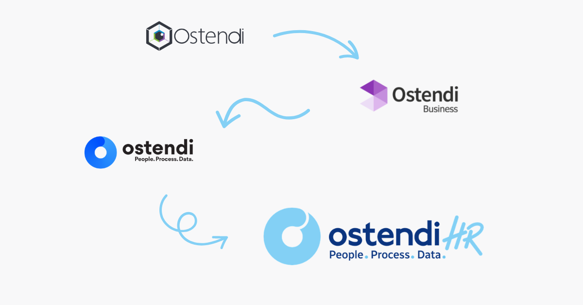
Fun fact – this is how we changed our logo through the years. Our first logotype evolved into a more modern shape. Along with time hexagon is reshaped into a circle, which is the symbol of development and change. It also was the inspiration to create the newest logotype of our brand.
Today premiers our new website, the whole visual aspects of our communication will change. You will also see changes in applications and reports. No worries, it’s still us – the Ostendi team. But a little bit fresher this time.